
Shop Protect America
2019 – Website – Role: Concept, Design, Build
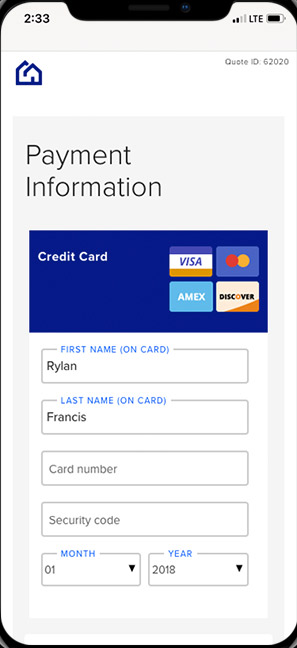
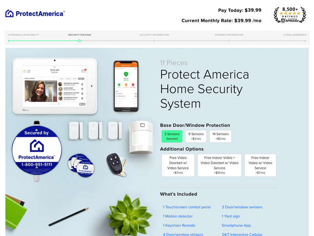
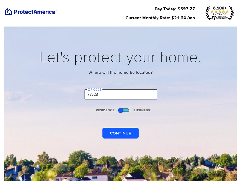
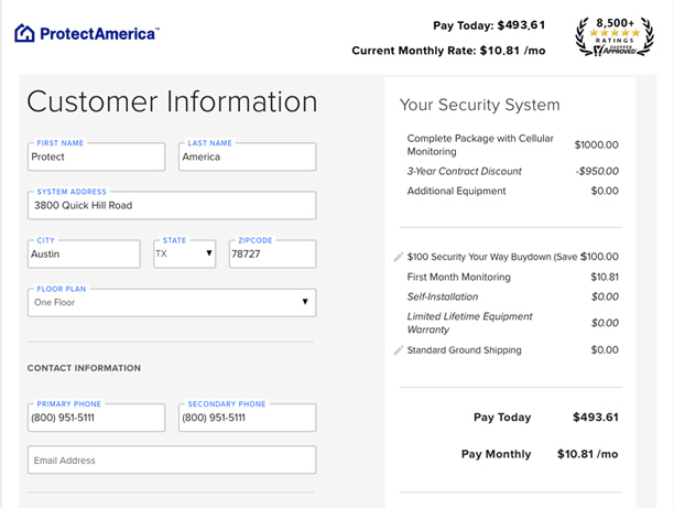
A complete e-commerce experience developed from the ground up to encapsulate and simplify the home security buying process. Protect America prides itself on the tailored experience and customization it offers its customers. Particular attention had to be paid to allow customization while not bogging down the visitor with too many options.
User Personas
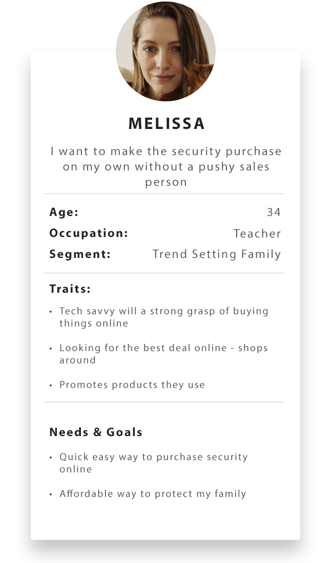
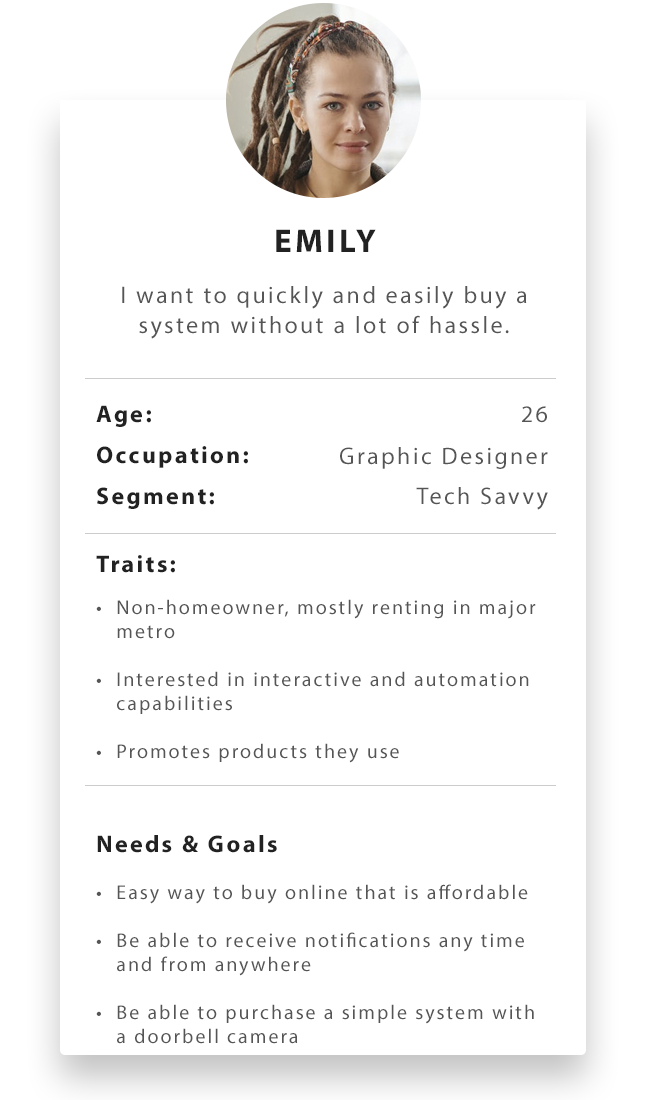
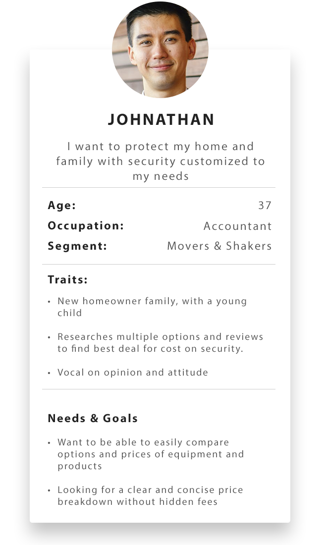
The original driving impetus for an e-commerce solution came from analyzing lead arrival patterns and comparing them to our hours of operation. 26% of our visitors came in outside our operating hours with a significant reduction in sales conversion by 36%. Having a self service e-commerce system would allow customers to purchase on their own without the need of a live salesperson. Further customer surveys, competitive analysis, and 1 on 1 interviews, bolstered our hypothesis with many users wanting a low-pressure approach to buying security. The need for a full fledged e-commerce solution became apparent and user personas were created centered around customized segmentation data that tied to Protect America's customer base.
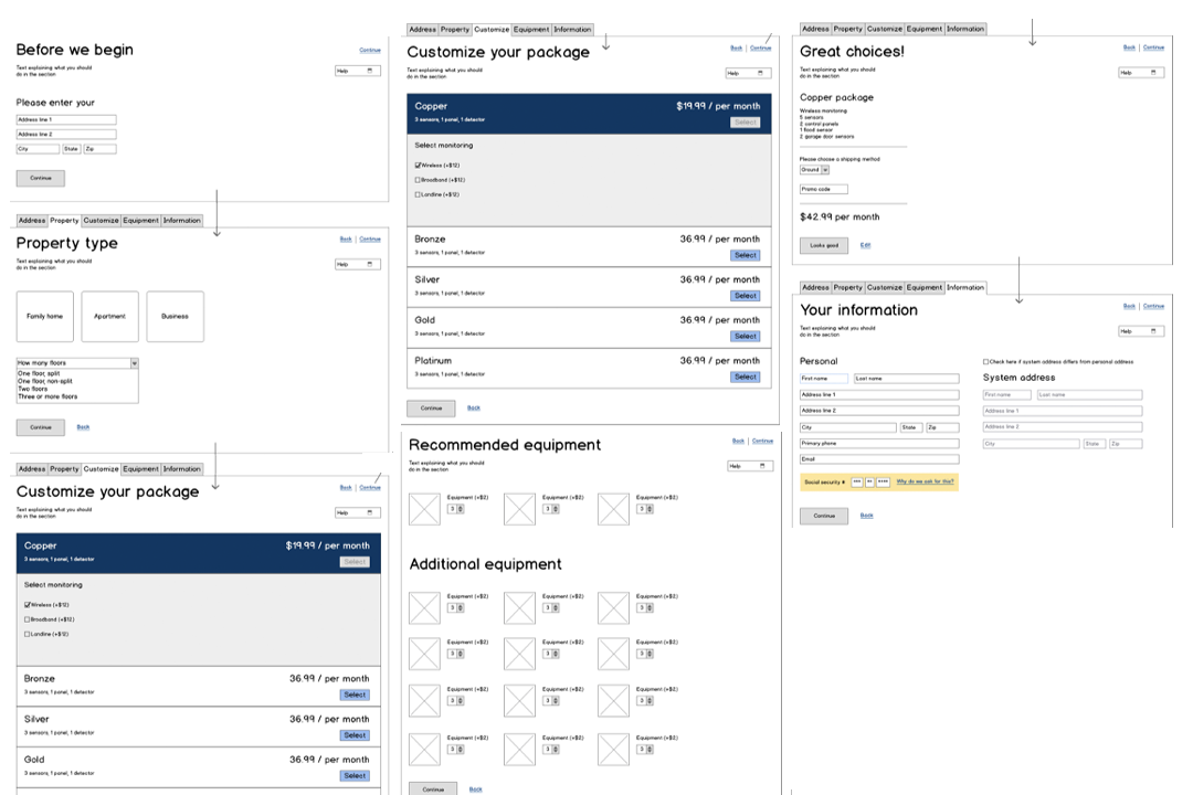
Wireframes & Prototypes
The majority of the company’s sales occurred through a call center with a well developed sales process that adhered to laws and regulations of the home security space. I determined that repurposing this sales process as a starting point would be ideal from a time and resources perspective. Early wireframes were developed to show how a customer might navigate through our buying process without assistance. These early wireframes became a solid foundation to building refined prototypes.
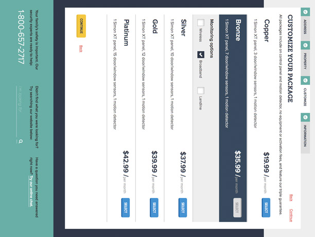
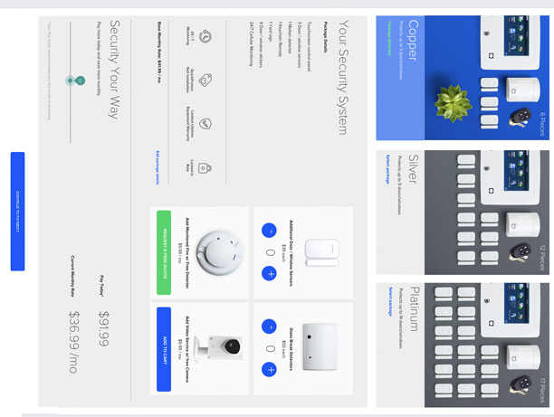
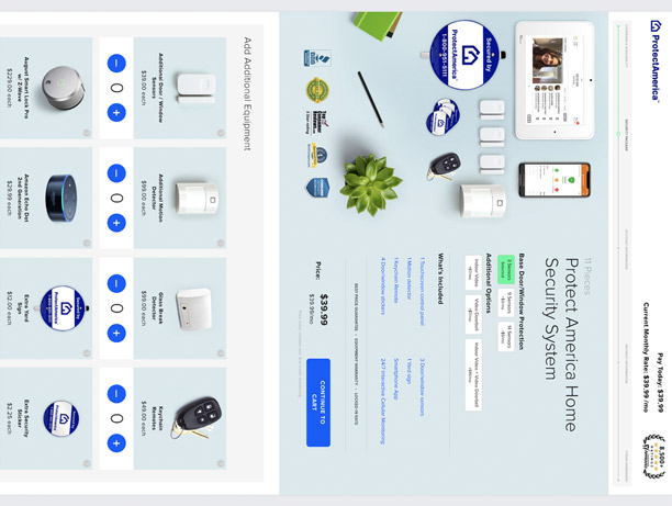
Usability Testing & Prototypes
Throughout the process, usability testing was instrumental in refining the product to a viable launch state. From this stage of the design process, key learnings showed that our breadth of product offerings was much too large. Users were ending up lost skipping many security options altogether in testing. This influenced the design greatly, changing over multiple iterations to simplify the e-commerce product offering and providing an improved user experience.
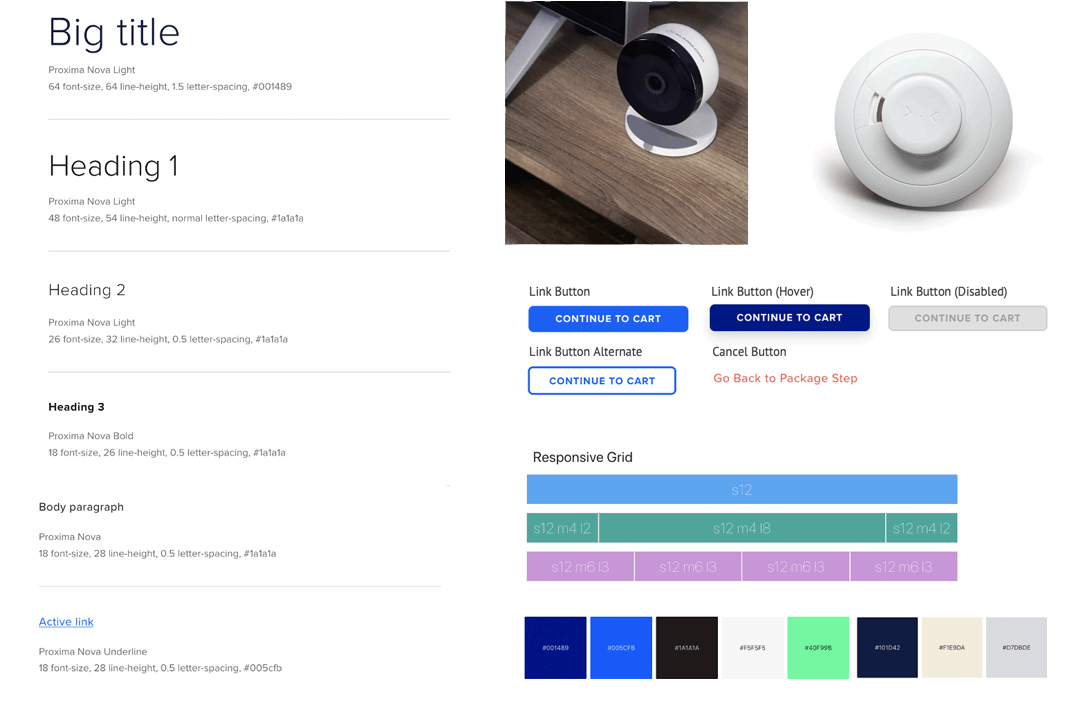

Design System
Already having a strong design system for the main Protect America site, many design elements were carried over providing a built-in cohesive look. However, additional design elements were created to represent the various actions that would occur when a user selects items. With cart updates happening in real-time, it was important to show the design responding. A simple thing like an animated price change provides a positive reaction showing that a user's selection has been received.
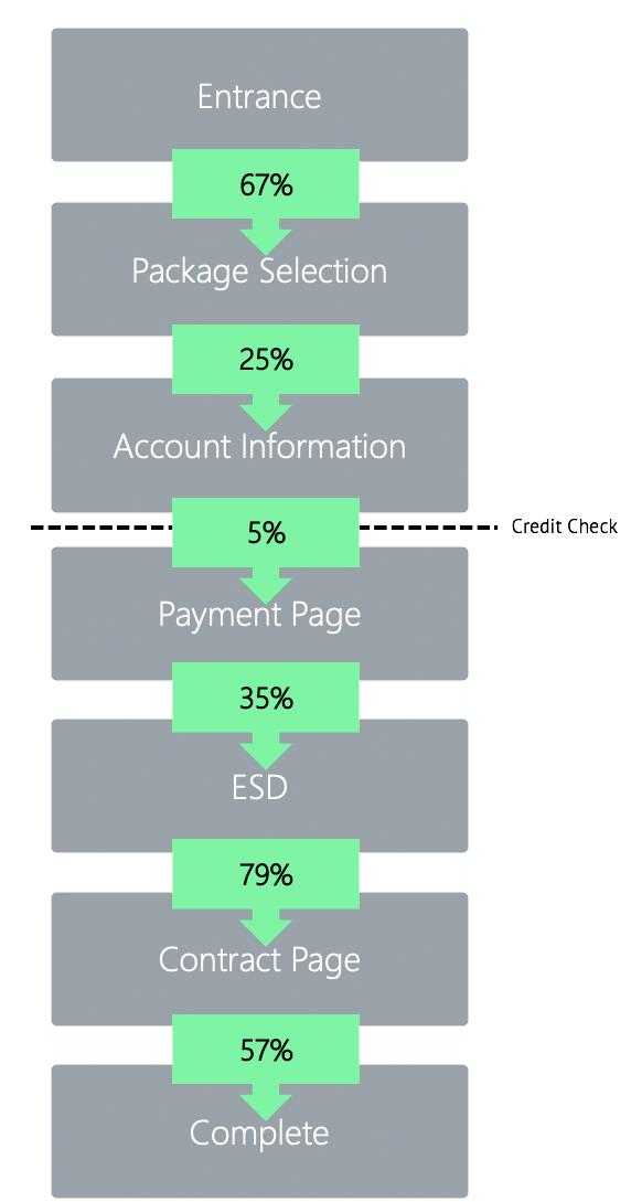
Information Architecture and Data Collection
The results of usability testing and prototypes meant that many steps were removed or condensed from the original wireframes. So as the product neared launch, a clear product architecture was finalized. This allowed a complete, real-time feedback loop to be designed into the system and integrated with Google Analytics. This feedback loop provided essential data for future product improvements and A/B testing through an iterative process. Features like an added auto complete address box allowed me to see marked improvement on the Entrance Step going from 48% percent to 67% percent.
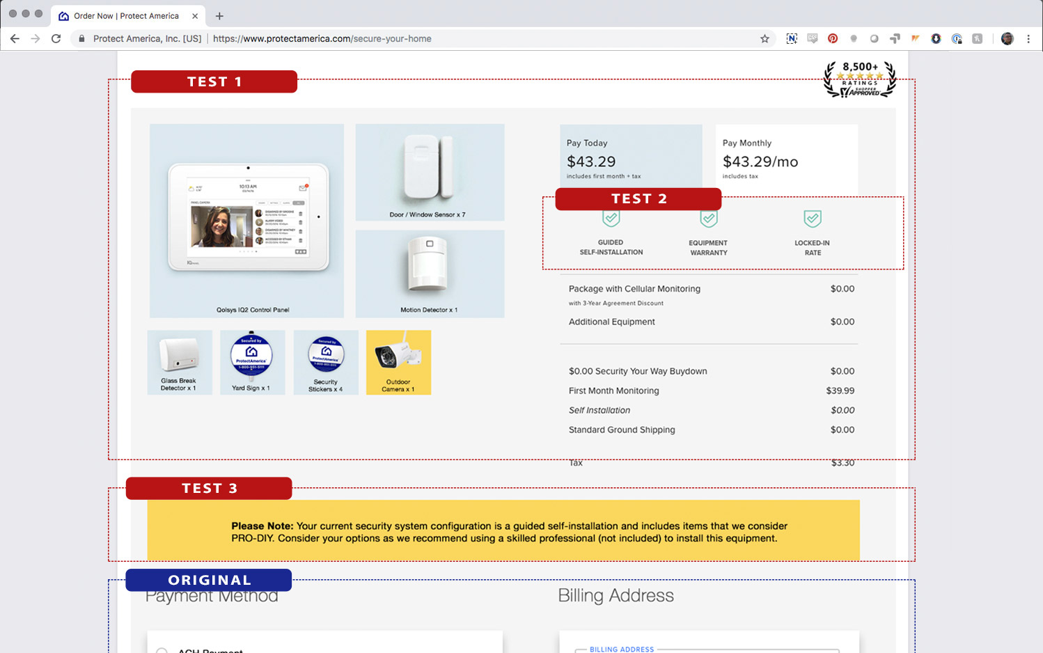
Iteration & Testing
A design is never finished and once launched, A/B testing and new features continue to evolve the product. Every piece of the e-commerce platform uses an extensive backend of attribution and error tracking. With this quantitative data, content changes to sections of the buy-flow were redesigned. A/B testing according to key performance metrics allowed us to optimize the site over time.


